I’m a backend developer working on a project, and I really liked the design of the Colorlib Wizard 14 template, so I decided to use it. Please know that I have very small to no experience with CSS.
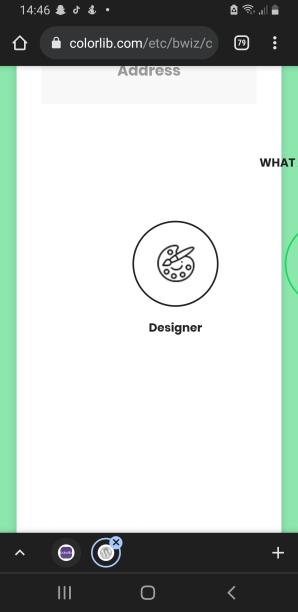
The template is great, but the radio button section (“Account” part) is sadly not mobile responsive and the buttons end up being outside of the screen. I tried my best to fix this but since I have no experience with CSS I couldn’t be able to fix it.
I don’t know if I can get any help from here, but I would appreciate it if someone could help me make the “Account” part mobile-friendly.
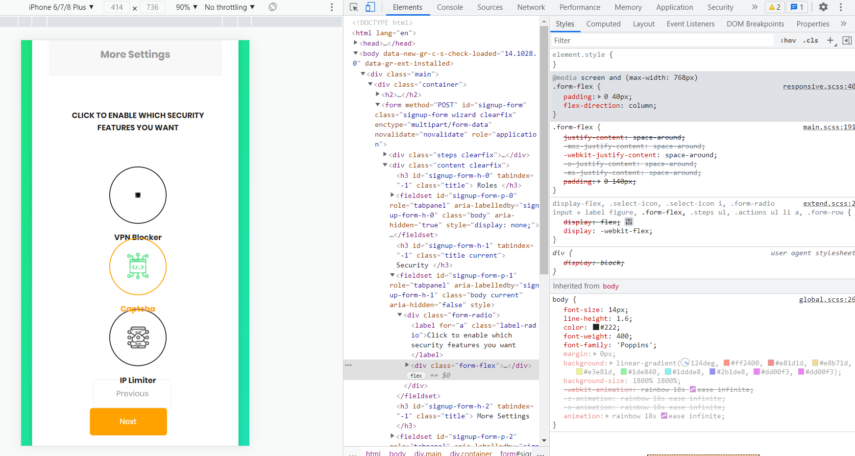
Thank you once again for the reply. I added the custom CSS to my website, and while it did fix my website, I was wondering if there’s a way I have a space between the radio buttons so the text doesn’t end up going over the next button and making it look cluttered as shown on the image.