Hi there!
Tried to CSS hack it but didn’t help, is there a way to reduce the padding btwn nav items and also ensure nothing (nav list items and black bg) gets cropped off please?
Thanks much!
Hi there!
Tried to CSS hack it but didn’t help, is there a way to reduce the padding btwn nav items and also ensure nothing (nav list items and black bg) gets cropped off please?
Thanks much!
Hi there
Yes, you may use this css code:
.navbar-nav > li {
padding: 15px 6px;
}
Hi!
Hmm thanks for the reply but it’s not working, 2 menu items remain lost in the post contents…
Hi
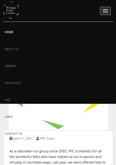
May I see it? please provide screenshot and I will check it
Thanks, I see it now, you may use this css code to fix your problem:
@media (max-width: 767px){
.nav.navbar-nav {
background: #000;
}
.site-navigation-inner.col-sm-12 {
padding: 0px;
}
}
Thanks Noda! That’s fixed now!
But is there a way to have some padding on the left please? Now the entire mobile menu is flushed too close to the left edge.
Yes, you may use this code:
@media (max-width: 767px){
.nav.navbar-nav {
padding-left: 50px;
}
}
Thanks so much! All good now!
Thank you too and have a nice day