Hello, on my website www.artsabord.com my main image on homepage look good on computer but not on mobile (too big and cut). Menu is not clear too.
Can be great if you can help me,
damien
Hello, on my website www.artsabord.com my main image on homepage look good on computer but not on mobile (too big and cut). Menu is not clear too.
Can be great if you can help me,
damien
Hey there
You can use this css code to fix it:
.navbar-collapse {
    background-color: #fff;
}
Add it in Appearance > Customize > Additionall CSS
Regards
Thank you for help me !
I add css code but nothing change on my mobile.
DO you have an other idea for additionnall css ?
Hi there
Please clear the cache, it’s working 
Regards
Hi, thanks for your help.
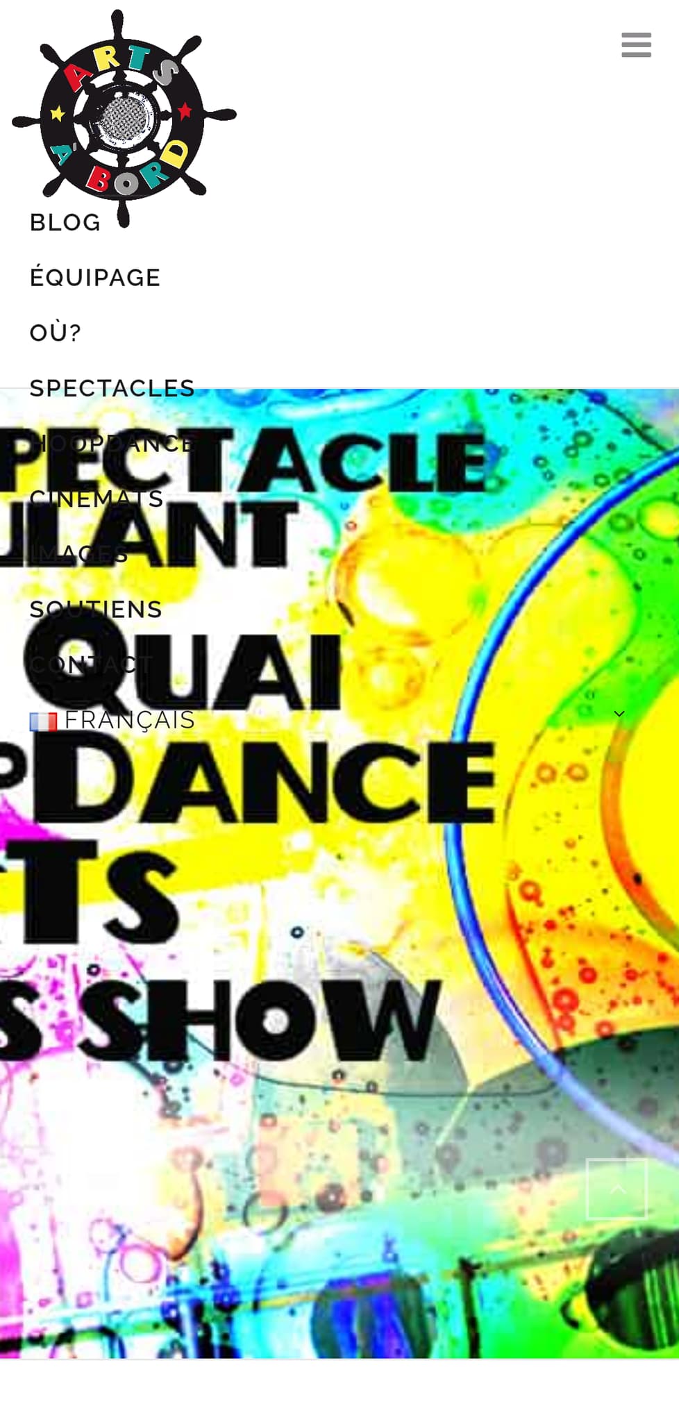
Yes is working for MENU. But not for main image (too big and cut on my mobile), do you have a suggestion?
And for menu, is it a way for my mobile, when i click on exemple “SPECTACLES”, I would like MENU disappear ?
Hi there
Its a parallax image and you added text on the image, unfortunately, your image will not be centered to fit on mobile to read all the text, actually adding text on image is not a good idea
Sorry, but no, this is how this menu is coded ((