Hi there,
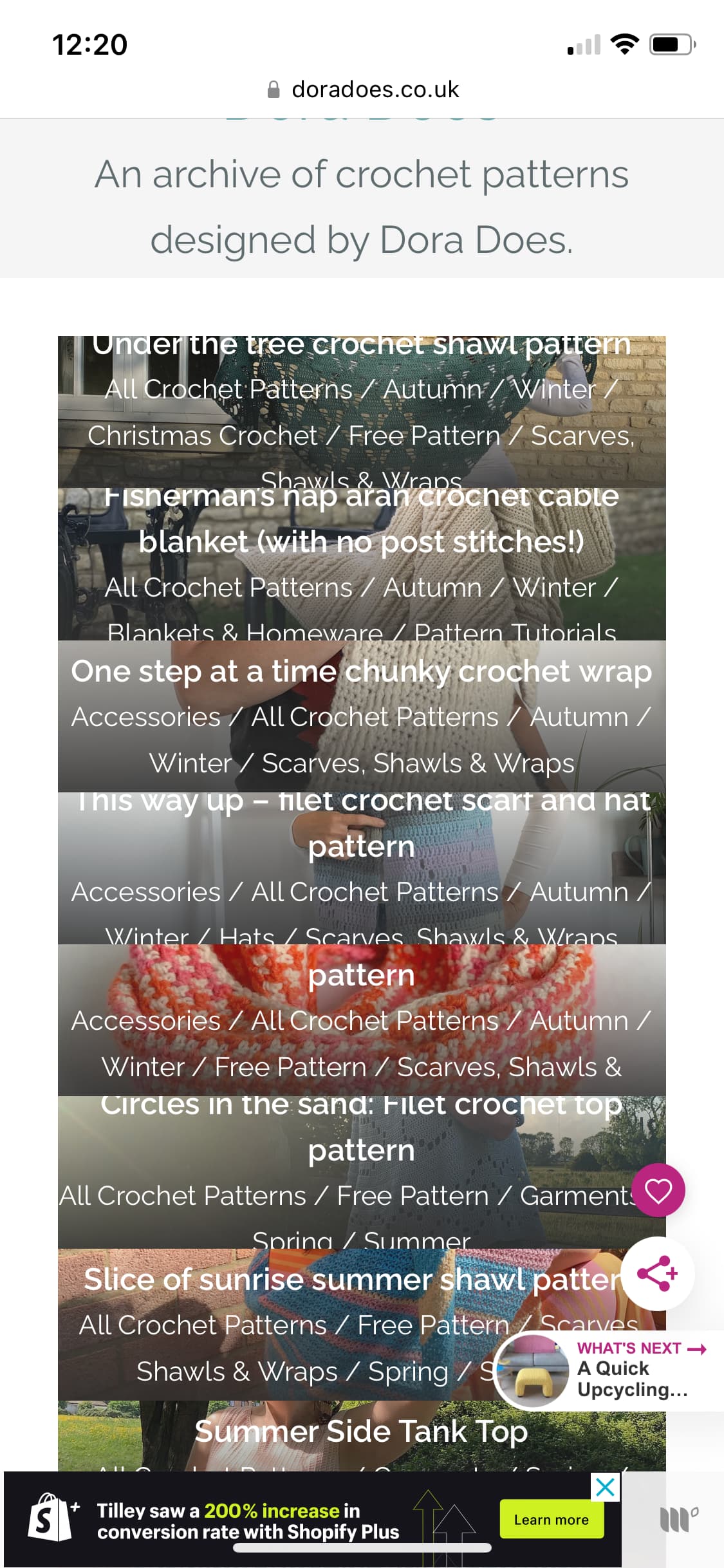
I am having issues with the way my images are displaying on my portfolio homepage on mobile (it’s fine on desktop and ipad):
This is the project home page: https://doradoes.co.uk/portfolio/
The first few images display fine but after that older images kind of zoom up and cover the more recent ones so that only a fraction of the portfolio images can be seen. This is a new issue as it used to work fine.
I use the masonry setting on the project homepage with sidebar right selected. (The grid setting also looks odd on mobile so I stick with masonry). I have maximum portfolio images to display set to 90 as I thought this may be an issue but that hasn’t made a difference (I used to have it at 100)
I thought it might be a lazy loading issue but I have deactivated lazy loading on that URL and I am still having the same problems.
Can you advise?
Thanks
Hi there
Looks like you are using JetPack, it optimizes images in a different way, can you please temporarily deactivate it to see the effect without this plugin?
Regards
Hi, thanks for the response.
Which part of jetpack should I be deactivating? If I deactivate the whole plugin then my portfolio section will disappear altogether (I found this out by experience) - As I understand it the portfolio option needs activating within jetpack to allow the theme to work - if this is not the case, please advise.
I do not use jet pack for lazy loading (I have a separate plug in called A3 Lazy loading)
Thanks
Hi there, do you have any additional feedback on this. I am still getting issues with the portfolio home feed images not displaying correctly - I have switched off lazy loading in jetpack.
Thanks
Hi there
Can you please provide a screenshot? this is what I have right now: Screenshot by Lightshot its normal, I don’t have any issues?
Hi there,
Thanks for coming back to me. It is only an issue on the mobile view. The desktop works fine. Here is a screen shot of me trying to capture what happens - I took a screen recording as that makes it easier to see, but it won’t allow me to upload it.
If you visit Projects Archive - Dora Does on mobile and scroll down to look at the different portfolio images you will see it happening. Once the load finishes, it misses out about 40 portfolio items.
Thanks
Michelle
Hi Michelle
Honestly I tried many things but I still cant replicate the problem, on the mobile all the portfolio elements are stacked on each normally and i don’t have any anomaly here,
Hi there,
I am still having the same issue with the portfolio home page loading incorrectly on mobile. As you scroll down the page all the portfilo images jump and overlap each other so you can’t scroll through all of them.
I have made a screen recording and as I can’t attach it, I have saved it to my google drive so that you can see what I mean.
https://drive.google.com/drive/folders/1jg7NWK8QNDIKUx-CML9SAEHhdsvVZAKs?usp=sharing
It really does look messy, stops viewers seeing all the portfolip images. I have deleted my lazy load plugin in case there was some sort of conflict but I can’t get it to change.
If you can’t suggest a fix, is there a way to reconfigure the portfolio homepage so it shows similarly to the blog roll?
Thanks
Hi @doraexplored
Please provide url of the website to check it
Regards
Hi there, it is detailed earlier in the thread but the home page is doradoes.co.uk and the portfolio page (where I am experiencing the issues on mobile) is Projects Archive - Dora Does
Many thanks.
Michelle
Hi @doraexplored
WHich model of the phone do you have? this is what I have when im checking this issue: Screenshot by Lightshot
Regards
Hi there,
I have an iphone XS / 10.
In the screenshot, that is what i see too. The first few portfolio images are fine but once you get to around 4 or 5 pictures down as you scroll, the pictures do the weird overlapping thing and you can’t see all the portfolio pictures. If you compare scrolling on mobile vs desktop - you have to scroll as the initial screen looks fine - you will start to see what I mean. My screen recording illustrates what I mean.
The issue has been ongoing for around 6 months so it’s not related to a recent update.
Thanks
Hi
Ok, I was not able to replicate it but please try this solution, add this CSS code in the Appearance > Customize > Additional css:
article.post-snippet {
    display: block !important;
}
Let me know the results
Regards
Hi there,
So strange you can’t reproduce it on mobile. I checked it in chrome this morning and it is still the same messy presentation. I have included a screenshot of what it looks like this morning which may be clearer for you to see. I reduced the number of portfolio options in the wordpress dashboard so the latter half appears like a blog roll and I still get all the square images overlap. then the first blog roll landscape image overlaps them.
I tried adding the css and it hasn’t seemed to change anything…
screenshot below from this morning in chrome.
I’ve been playing around with layouts this morning and it could work better using the grid layout instead of masonary but is there away to remove the project categories from the images so it just shows the title? (screenshot attached of what the grid view currently shows on mobile).

Many thanks
Michelle
hi Michelle
I tried many things but I always have the same result
You can use this code to hide categories:
@media (max-width: 991px){
.inner-title .title span {
display: none;
}
}
Hi there,
I am still getting this issue and have tried it on various mobile phones on safari and android / chrome.
On top of this, I am now having issues where the images on the portfolio home page become un-clickable - they simply do not respond and I find myself having to refresh the page many times to make it work.
Is there a maximum number of portfolio items after which the theme becomes unstable?
Thanks
(the site page is doradoes.co.uk/portfolio)
Michelle
Hi Michele
So sorry about this, please try this code:
.post-type-archive-jetpack-portfolio .project {
    min-height: 280px;
    margin-bottom: 10px !important;
}
And if it’s not working again please provide access details of your website in DM
Regards


