Currently i have a problem with the responsive design on new mobile devices. Due to the high display resolution of such new smartphones, the mobile version just looks like a small desktop version (e.g. logo is too small, text is too small, etc.).
I know how to change the breaking point and therefore the font size, but that really doesnt solve the problem. Therefore the preview in the customizer section for mobile is much larger then the real site on a new smartphone.
yeah but in my opinion that isnt really user friendly. We already had some complaints about the small navigation and the small text. So isnt there any possible solution to bypass that effect? Most traffic on our site is by tablet and mobile. Therefore its a bit tricky if the mobile view doesnt display properly.
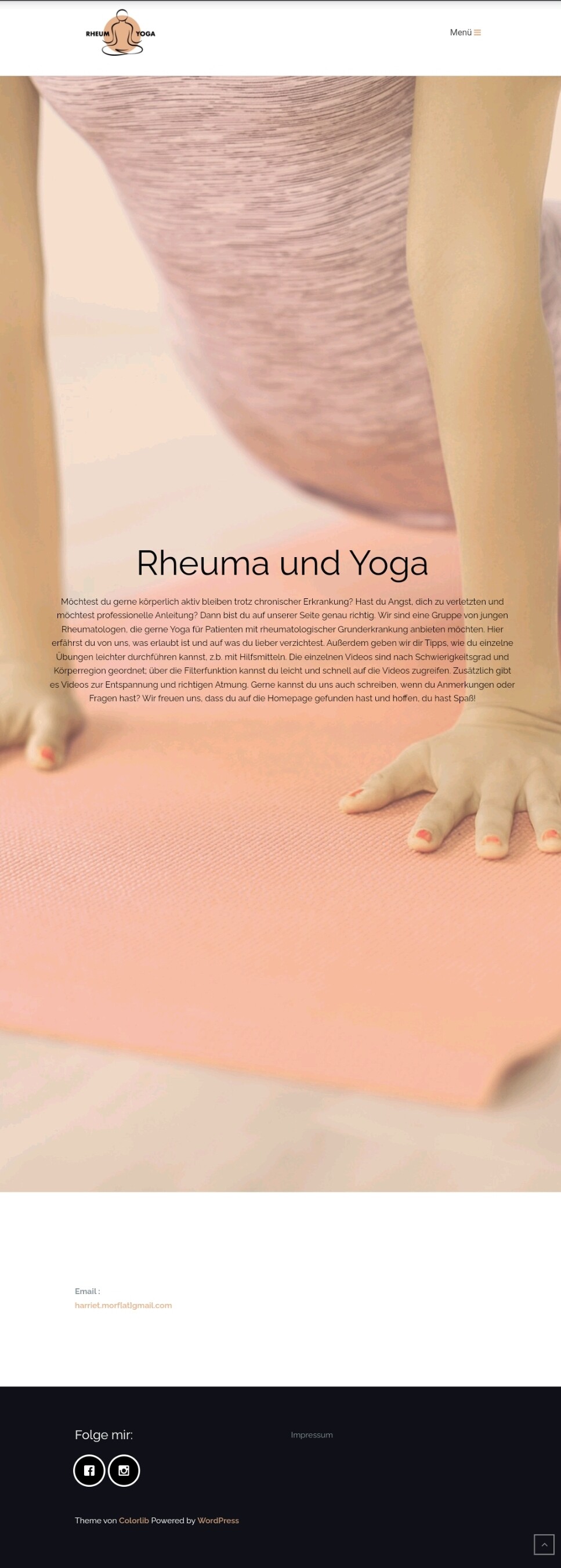
This is how it appears for me and I think this is absolutely normal, we have the exact same appearance on our website, Screenshot by Lightshot
If you want to change something on this layout let me know and I will help, but only saying “site is not responsieve” is not a problem description, let me know what exactly you want to change