Hi there,
When I go into customize and check how the individual product pages will look in each device, it shows a smooth transition between each. However, when I look at the individual products on my website in chrome (or samsung internet) on my phone the photos are beside the description on the page causing a long white line down the left side and the images are smaller than in the mobile format viewer when in the customize portion of my theme.
I tried deactivating plugins and it didn’t help. I am not sure what to do at this point.
For full effect please look at the link on your mobile device.
Thanks in advance for your help!
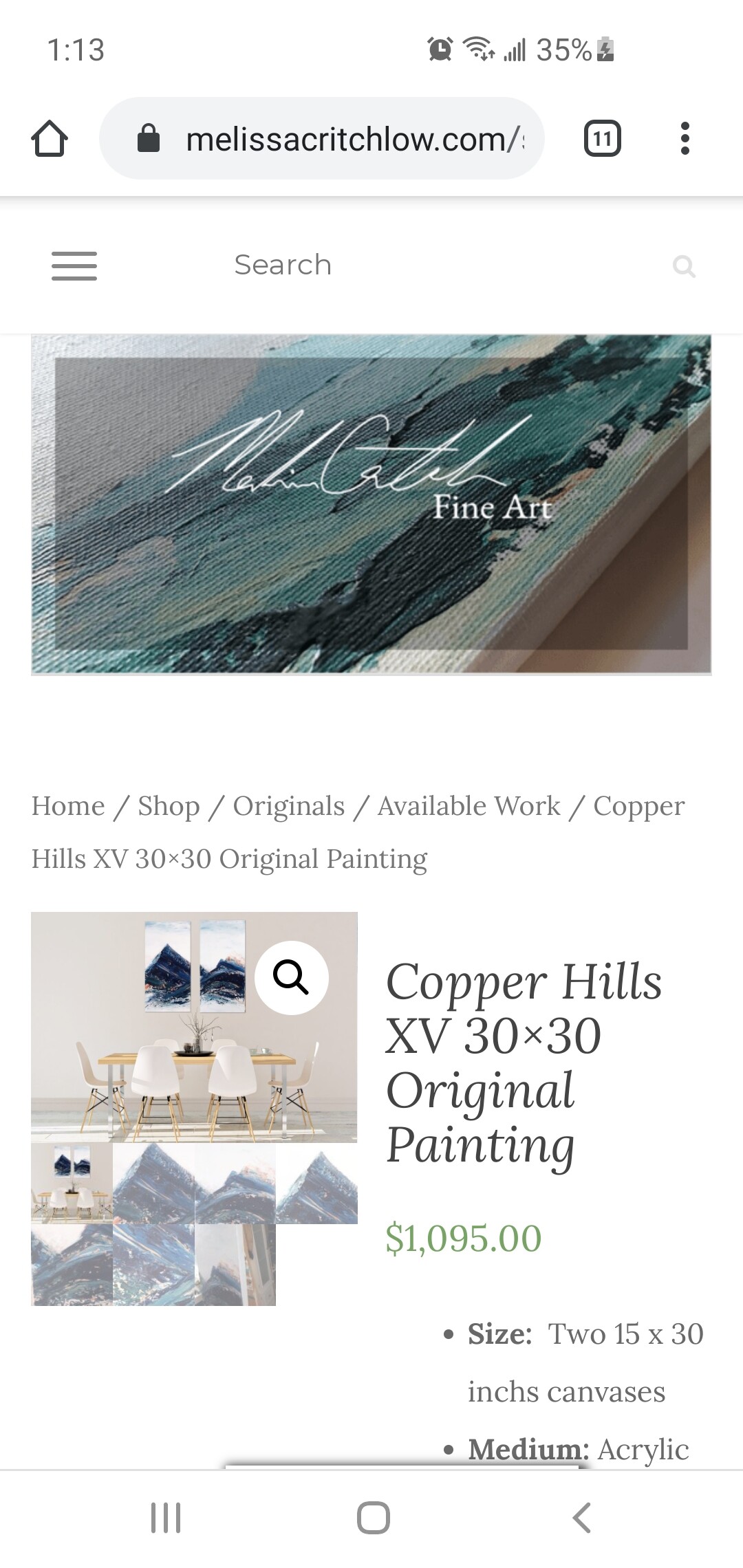
The page I need help with as an example, it’s happening to all the product pages:
https://melissacritchlow.com/shop/copper-hills-xv/
Please view on mobile device to see the issue.
Hey there
Sorry about that, please provide a screenshot of the problem, I want to be sure we are seeing the same problem
1 Like
Thanks for your quick response!
I have attached the screen shots here.
It goes on like this, with the words on the side until it hits the bottom related items.
Hey there
this is how the theme works by default and you cant change it only by deactivating plugins 
add this CSS code in appearance > customize > additional CSS
@media (max-width: 768px){
.woocommerce #content div.product div.images, .woocommerce div.product div.images, .woocommerce-page #content div.product div.images, .woocommerce-page div.product div.images, .woocommerce #content div.product div.summary, .woocommerce div.product div.summary, .woocommerce-page #content div.product div.summary, .woocommerce-page div.product div.summary {
width: 100%;
}
}
1 Like
That did it! Perfect thank you so much!!!
Thank you too, have a good day