Hi there,
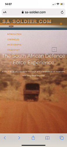
is it possible to place a background image into the white menu bar at the top of the page?
I’ve tried the following css:
.main-navigation {
background-image: url(“https://www.sa-soldier.com/Wordpress/SADF-banner2014-long.png”);
background-position: left;
background-repeat: no-repeat;
}
but this is not having any effect
Hey there
It’s possible, please provide a link to the page and I will verify it
1 Like
Thank you for your time. Here is the link:
https://www.sa-soldier.com/Wordpress/
What I’m trying to do is get this banner into the background
Any assistance would be much appreciated
Hi
Sorry, but im afraid this is not possible, but I can help you to set the header bg image fo the navigation section, if this is something you want to have give me a url of the image you want to use
1 Like
Hi, can you help with this issue?
yes, I can, for this, I need a url of the image you want to use as a background image 
1 Like
Here we go:
.main-navigation {
background: #0000 !important;
}
header#masthead {
    background-image: url(https://www.sa-soldier.com/Wordpress/wp-content/uploads/2020/11/SADF-banner2014-short.png);
    background-size: contain;
    background-repeat: no-repeat;
}
1 Like
Hello Noda,
thank you very much for the code. It’s almost perfect 
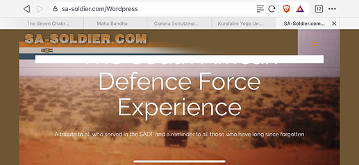
It behaves well on mobile, but on desktop the image doesn’t stay with the header when scrolling with “sticky header” on. Also, the header is transparent now when it should have the same colour as the page = #73542e
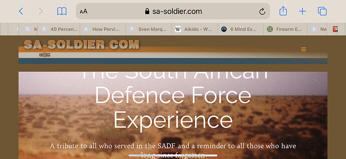
Screenshot when page opens
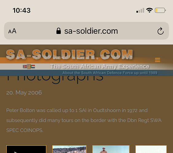
Screenshot when scrolling
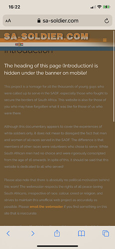
Another issue is the heading of other pages is now half hidden under the navigation bar … only on mobile
Would you mind taking another look?
Thank you in advance and greetings to the beautiful country of Georgia 
Hey there
Well, yes, I see… what about using different images for desktop and different for mobile? it’s definitely not a good idea to use the same image especially with the text on it in this case
this code to add BG in the sticky header:
nav.fixed.scrolled {
    background-image: url(https://www.sa-soldier.com/Wordpress/wp-content/uploads/2020/11/SADF-banner2020.png) !important;
    background-size: 695px !important;
    background-repeat: no-repeat !important;
    background-size: cover;
background-color: #73542e !important;
}
Ah, man, thank you so much  have a great day and greetings from sunny Georgia
1 Like
Thank you so much for your help. It’s looking really good now but there are still a few issues, particularly on mobile:
- I need the menu to be in the same brown #73542e. Right now it is transparent
- The page header of all pages is hidden underneath the navigation bar
I appreciate your assistance
Could you help me with those two issues below? I have no idea how to solve the problem myself
Hi @cottonbean
Sorry for the delay, dunno why i missed this ticket
- and 2. use this code:
@media (max-width: 991px){
.nav-bar .module-group {
width: 100%;
background: #73542e;
}
.post-content .entry-content .post-title {
padding-top: 30px;
}
}
1 Like
That has solved problem 1 and 2 above thanks. Now there’s an anomaly when viewing on iPad or mobile in landscape view. As you can see in the image below,
the area under the navigation button is transparent and the menu seems to be overflowing below the header.
Would you mind taking another look please? I really appreciate it.
Have a good weekend

Hi
Ok, I see, please use this code:
header#masthead {
background-color: #73542e;
}
@media (max-width: 991px){
.nav-bar .module-group {
background: #0000;
}
}
Have a nice weekend 
1 Like
Hello Noda, that seemed to have solved that problem thank you so much!
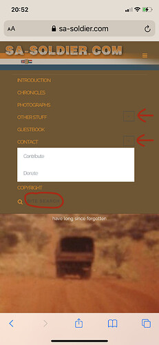
Now could you help me change the colour of the menu items that I have highlighted below to orange #dd8500? The current grey colour is hard to read on the brown background. Also, can we change the submenu to brown #73542e and links to orange #dd8500 as well?
დიდი მადლობა 
Wow, you were able to amaze me @cottonbean, how do you know it? where are you from?
thiese are necessary codes for you:
@media (max-width: 991px){
.shapely-dropdown {
border-color: #f00;
color: #fff;
}
.main-navigation .menu > li > ul {
background: #73542e;
}
.search-widget-handle .search {
color: #fff;
}
}
Have nice day
მადლობა შენც 
1 Like
Hey man, I’m South African  and very interested in other cultures, especially those in your part of the world. ქართული ანბანი ისეთი ლამაზია. Fascinating! Dude, thanks again for your sterling help here.
My layout is just about there where I want it but there is an issue that I don’t understand. When I rotate my mobile I get a brown strip below the header. What do you think is causing that?
Maybe there’s a conflict in the CSS?
@media (max-width: 991px){
.shapely-dropdown {
border-color: #dd8500;
color: #fff;
}
.main-navigation .menu > li > ul {
background: #73542e;
}
.search-widget-handle .search {
color: #ffffff;
}
}@media (max-width: 991px){
.nav-bar .module-group {
width: 100%;
background: #ffffff;
}
.post-content .entry-content .post-title {
padding-top: 30px;
}
}
@media (max-width: 991px){
header#masthead {
position: fixed;
width: 100%;
z-index: 99;
}
}
.main-navigation .menu li a {
color: #dd8500;
}
#page .menu li a {
font-size: 13px;
}
.main-navigation {
background: #0000 !important;
}
header#masthead {
background-image: url(https://www.sa-soldier.com/Wordpress/wp-content/uploads/2020/11/SADF-banner2020_2500_long.png);
background-size: 1710px;
background-repeat: no-repeat;
}
nav.fixed.scrolled {
background-image: url(https://www.sa-soldier.com/Wordpress/wp-content/uploads/2020/11/SADF-banner2020_2500_long.png) !important;
background-size: 1710px !important;
background-repeat: no-repeat !important;
background-size: cover;
background-color: #73542e !important;
}
header#masthead {
background-color: #73542e;
}
@media (max-width: 991px){
.nav-bar .module-group {
background: #0000;
}
}
Howdy 
That’s so nice to hear, especially from someone who is thousand km away  if you have any interest let me know
hm, what is the model of your phone? I tried it on my android phone and one IOS device but I was not able to replicate your problem 
1 Like


 have a great day and greetings from sunny Georgia