On the website geekburst.uk- if you select mobile, then features in drop down, on some devices (a tablet in my test) the menu text goes off the edge of the screen. Is there a way to make the drop down appear on the left hand side where’s more screen space instead?
Also, on mobile devices is there a way where if people click on top level menu items, it will open the drop down? It’s quite difficult to click the little arrows.
Hi there
“devices (a tablet in my test) the menu text goes off the edge of the screen” - Can you show a screenshot?
You can use this css code to fix click problem on the dropdown carret:
@media (max-width: 767px){
.navbar-nav>li>.caret {
    top: 29px;
    height: 18px;
    width: 25px;
}
}
.caret {
    border-top: 11px dashed;
    border-right: 11px solid #0000;
    border-left: 11px solid #0000;
}

Couple other things.
-
Is there a way to make the titles clickable to open the drop down menu and just the arrows?
-
On some of the longer drop downs the text goes off the menu on a mobile device, rather than the menu box expanding to accommodate.
Hi there
What is the resolution of your screen? I have a full HD screen and this is what I have: Screenshot by Lightshot I have plenty of space on the right
Screenshot by Lightshot looks like you already fixed it?
For the menu text going off edge of screen: As I said it’s an issue on tablet 2048x1536
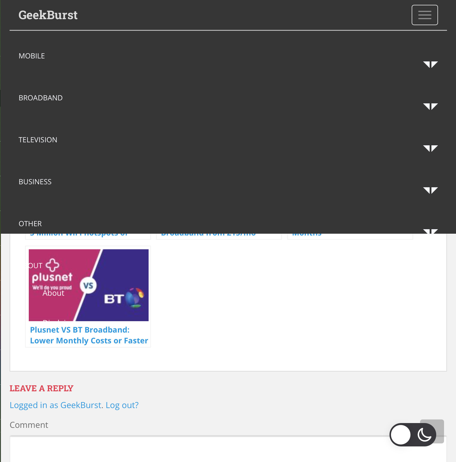
Regarding the text not fitting on menu on mobile, this is still an issue, you will need to scroll on page to an image, and you will see the items like the ‘about’ drop down don’t show up.
Hi @Geek can you please provide screenshots? sorry for asking but I think I need them 
I have already provided screenshots further up.
Here is another example. As you can see anything after the ‘business’ section in the example does not fit on the menu, this is made worse when opening a drop down.
Hi
yes, I see, did you make any customization for the menu?
Try this code:
@media (max-width: 767px){
.navbar-default .navbar-nav>li>a {
    padding-top: 5px;
    padding-bottom: 5px;
}
.navbar-nav>li {
    padding: 0px;
}
.navbar-nav .open .dropdown-menu>li>a {
    padding: 0px 15px 0px 25px;
}
.dropdown-menu>li {
    padding: 5px 15px;
}
.navbar-nav>li>.caret {
    top: 10px;
}
}
only changes are those advised here. I have added the code above and it has not resolved.
Hi @Geek
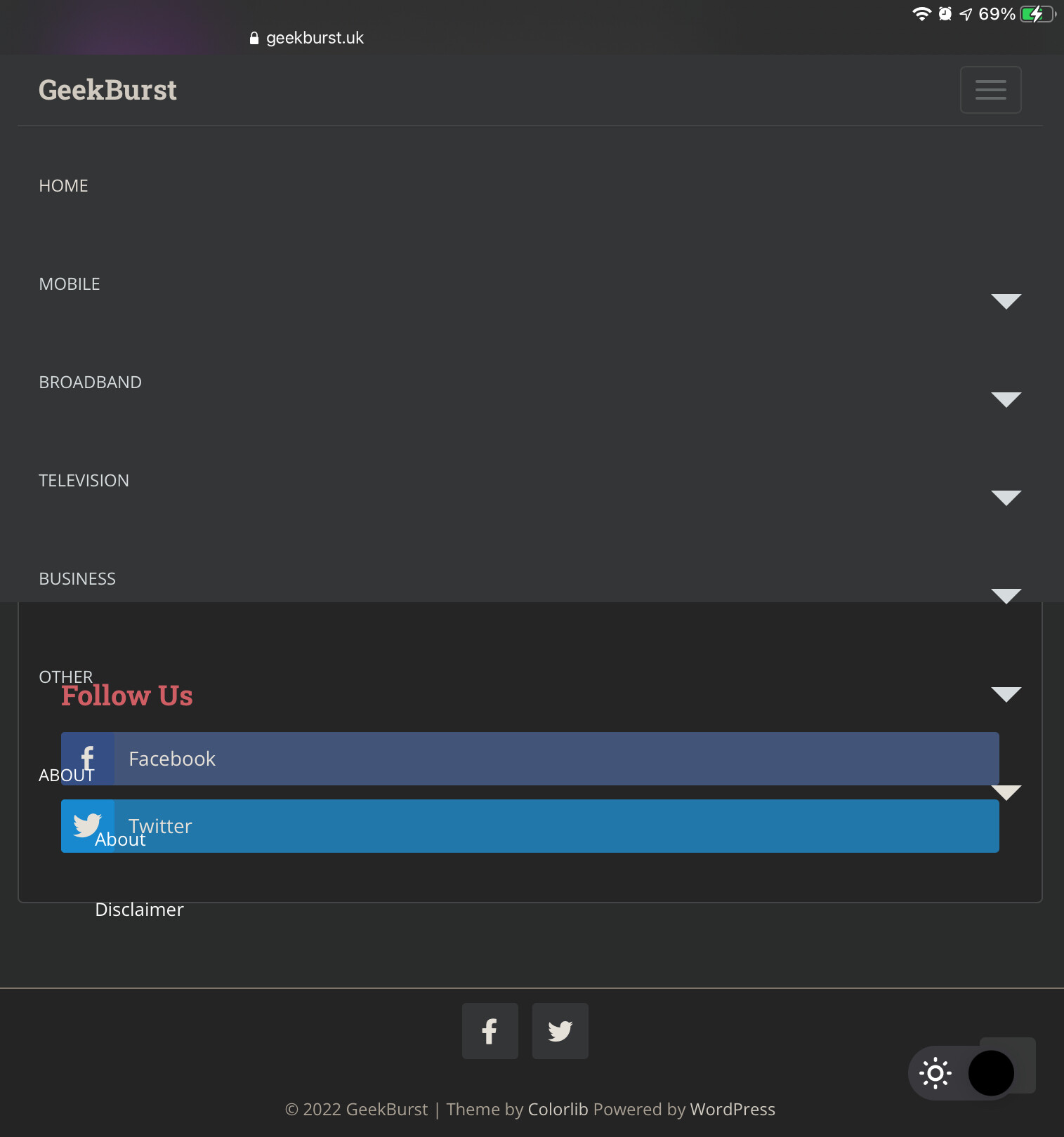
Please clear cache, all changes are applied, this is how your site is looking now: Screenshot by Lightshot
The issue still occurs if you bopen the about drop down, or any double layer drop down like broadband > low income deals
Hi Geek
Ok, this is how I have it: Monosnap what is the problem here? please provide screenshot from your site too
As in the attached picture you put here, you can see the ‘about’ item is over spilling on the screen.
Hey there,
I was about to say the same. I am also facing the same problem with me after the wonderful support of Colorlibsupport I have been easily solved my problem Now my website is working well…
1 Like