I got the Barber theme working well, for the most part. One issue, though, is that instead of one menu, the mobile theme seems to have created three, with the first one blank.
Here is what my desktop and mobile menus looks like:
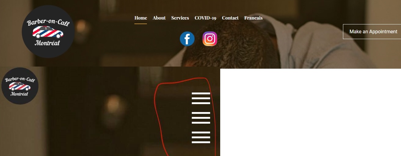
Is there a way I can edit just the mobile version? Or, is there something I can do with just the desktop version that will fix this?
So far, I have been editing visually with SeaMonkey and doing some code tweaks.