Hi
I have used Shapely for a number of projects with great success. Recently tested the home page of a new project in Firefox’s Responsive Design Mode and came away satisfied with the rendering. Tried the same on my iPhone 6 sys 14.4.2 (with Safari, Firefox and Chrome) and the layout has lost the most of the button in the top ‘Parallax Section for Front Page’. Wondering if this is common where the testing tools give wrong results? Are there work arounds?
Regards
brad4d
Hi there
Can’t say anything without seeing a problem, please provide direct link to the page and screenshot of the problem
Hi Noda
Thanks for your quick reply.
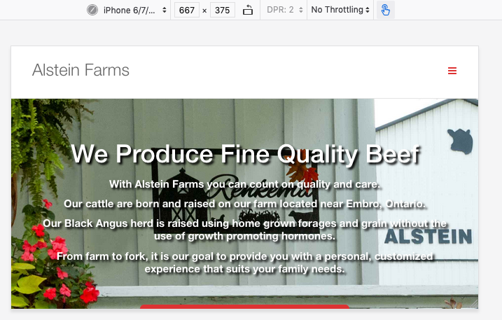
Attached are 2 screen shots. #1 is how Firefox 88.0.1 on my mac running Mojave and #2 is a how my iPhone6 sees the same. In #2 when you scroll I immediately get the next widget. The button is covered.
The url is mswd.ca/farm.
regards
brad4d

hi
May I see it? header menu is visible on one screenshot while its not visible on another, thats why you have this problem
Hi
When I check my work in Firefox with Responsive Design Mode I get the top#1 image and the header menu is there, just couldn’t get it in the screen shot. I get the button with padding to the next widget.
On my iphone 6s, I get the header menu but when I scroll down I get the red thin line, no button and the next widget. My iphone runs sys 14.4.2. My wife phone is same 6s but sys 12.5. Her phone renders the home page correctly. Go figure!!
You can see the site at https://www.mswd.ca/farm
Thanks for your time.
Regards
brad4d
Hi there
That’s the screenshot from a real phone simulator from the Browserstack: Screenshot by Lightshot as you can see it’s normal, and results from the new devices rather than iPhone 6?
Have a look at the display in landscape.
Landscape shrinks the first widget container based on the size of the full screen background image in a small device. The image size seems to determine the size of the widget. Hence the button gets lost.
But, I’m beginning to think this is a phantom issue. I have seen a number of web comments about displays in browser responsive modes not matching reality and maybe it’s my small device.
I will move on.
Appreciate your input.
Regards
brad4d
Hi Regards
Well, yes, that’s something that is not easy to catch, I believe you may have some different views on different phones, did you try that?