Hi,
Thanks a lot for your work. Is it possible to center the logo and the menu, and put the logo above the menu in my site : www.expertigem.be?
If yes, can you please say me how to do it ?
Thanks a lot in advance.
Oli
Hi,
Thanks a lot for your work. Is it possible to center the logo and the menu, and put the logo above the menu in my site : www.expertigem.be?
If yes, can you please say me how to do it ?
Thanks a lot in advance.
Oli
Hello there,
I hope you are doing well today.
You can use the following CSS code to make the changes by going to Appearance > Customize > Additional CSS and pasting it there.
#site-navigation .container > .flex-row {
    display: grid;
}
.module.left.site-title-container {
    margin: 0 auto;
}

#site-navigation .container > .flex-row {
    display: grid;
    align-items: normal;
    justify-content: unset;
}

@media (min-width: 768px)
.navbar-collapse.collapse {
    padding-left: 213px;
}
Best Regards,
Support
Thanks a lot for the quick answer. I put the code you gave me in the previous message in additional css but it seems that there are some errors (see picture in attach) and doesn’t have any effect on the front line.
Can you help ? Thanks in advance.
Oli
Hello there,
Please remove the last CSS and add this instead:
#site-navigation .container > .flex-row {
    display: grid;
}

.module.left.site-title-container {
    margin: 0 auto;
}

#site-navigation .container > .flex-row {
    display: grid;
    align-items: normal;
    justify-content: unset;
}

@media (min-width: 768px)
.navbar-collapse.collapse {
    padding-left: 213px;
}
Best Regards,
Support
Thanks a lot. It works ! Best regards, Oli
Hello there,
I am glad the solution worked for you.
Please feel free to contact us again in the future regarding any other issues.
Best Regards,
Support
Its only working for Desktop view not for Mobile and tab view
Hi there
@Faizan2907 may I see your website? please provide URL and preferably screenshot if the issue
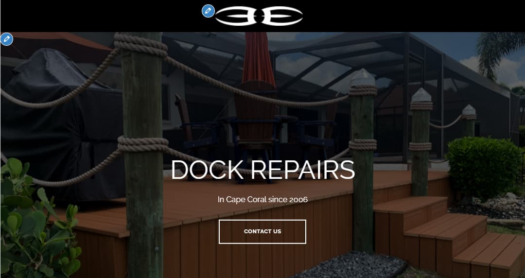
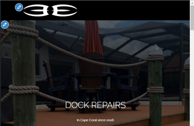
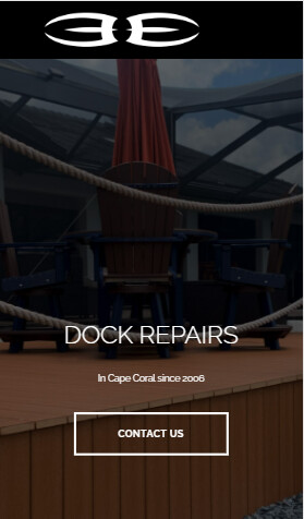
The logo getting shift to left on Tab and mobile mode.
Tab mode:
Mobile mode:
Here is the link of my website
Hi
Try this code:
.main-navigation a img {
    margin: 0 auto;
    display: block;
}