I have an issue with a website that I’m helping to develop (which uses the Illdy Child theme), specifically with the submenu functionality. Here is the link to the website to see for yourself.
As shown below, for some reason the first column of every submenu has a strange “white block”. Plus, the vertical alignment of the first column is different from the other columns. Don’t know if these issues are related or not.
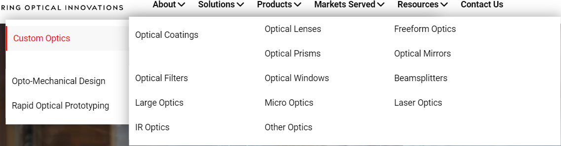
Any pointers and/or advice would be much appreciated!
Below is the CSS that is in the “Additional CSS” section:
.header-button-one {
    font-size: 0 !important;
    border: none !important;
    background: none !important;
    background-image: url("wp-content/themes/illdy/images/down_arrow.png") !important;
    background-repeat: no-repeat !important;
    background-position: center !important;
    margin-top: 50px !important;
}

.markets-served-item img{
    height:auto !important;
}

.markup-format table tbody tr td {
    border-right: #eee !important;
}

.markup-format table{border-right: 1px solid #000;}

.bottom-header h2 {
    font-size: 50px;
    font-weight: 700;
}

.col-md-8 col-sm-8 .markup-format a { text-decoration: underline; }

.blog-post h2 a {text-decoration: underline;}

.blog-post hr {border-top: 1px solid black;}

.page-numbers{list-style: none;}

.page-numbers li{display: inline-block;
  margin-right: 10px;}

.btn-primary:hover {
    color: #fff;
    background-color: #ED1C24 !important;
    border-color: #ED1C24 !important;
}

#breadcrumbs span span:hover {
text-decoration: underline;
}

.btn-primary {
    color: #fff;
    background-color: #ED1C24 !important;
    border-color: #ED1C24 !important;
     background-image: linear-gradient(to bottom,#ED1C24 0,#ED1C24 100%) !important;
}

graybg{background-color:#EDEDED !important;}

#header .top-header .header-navigation ul li.menu-item-has-children .sub-menu {

    min-width: 700px !important;
    justify-items: left;
  padding-right: 0px;
}

#header .top-header .header-navigation ul li.menu-item-has-children .sub-menu .sub-menu {
    display: block;
    /*display: grid; */
    grid-template-columns: 50% 50%;
    column-fill: auto;
    column-gap: balance;
    min-width: 700px !important;
    justify-items: left;
}


.page-id-2191 li {
    list-style: none !important;
}

header#header {
    background-attachment: scroll !important;
}

.page-id-1893 tbody tr {font-size: 18px !important; font-weight:400; !important}

#blog .blog-post .blog-post-meta{display:none;}

.blog-post-related-articles .related-article-title:after {
    content: "Latest Articles";
    visibility: visible;
    position: absolute;
    left: 14px;
}
.blog-post-related-articles .related-article-title {
    visibility: hidden;
}