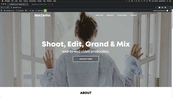
Hello,
The jumbotron imag / bottom header background image is scaled up when viewing on an ipad turned horizontally. Do you know why this is? When I view this on other devices such as mobiles or desktops the jumbotron image keeps it’s aspect ratio and scales itself accordingly - but on iPad it’s zooming in and cropping the edges. I was under the impression that the jumbotron image or video width automatically scaled to fit the viewing device. This is true for everything except for iPad horizontal.
Password: HolioTen
Screenshot attached with examples
rect jumbotron image styling CSS.
Hey there
Can you please check it on our demo? do we have the same issue?
To be honest I cant replicate this problem on my side,
Hello,
Yes the same issue occurs when viewing the demo site on an iPad.
You can test this by setting your browser to the resolution of an iPad Air W1024px H703px. Carrying out a few more test it appears the Jumbotron image zooms in and crops depending on pixel dimensions of the viewing device. Most devices work fine but there are quite a few that throws off scalling.
Can the bottom header background image be styled via CSS or is it hard coded into the template?
Dan
I may have found a solution in resolving this issue. I’ve increased the padding on `
#header . bottom header
This hasincreased the height of the bottom header container and revealed more of my 1920x1080 video - although I’m not sure if this was the right way to go about it.
Dan
`
Hi Dan
Nice to hear, yes you can use it no worries, it’s a pretty good solution 
SOLVED!
I received an answer in a similar thread.
I am using unique media queries for popular devices to resolved this.


