Hi,
I’m having two slight issues with my website here: ondrawiener.mzf.cz.
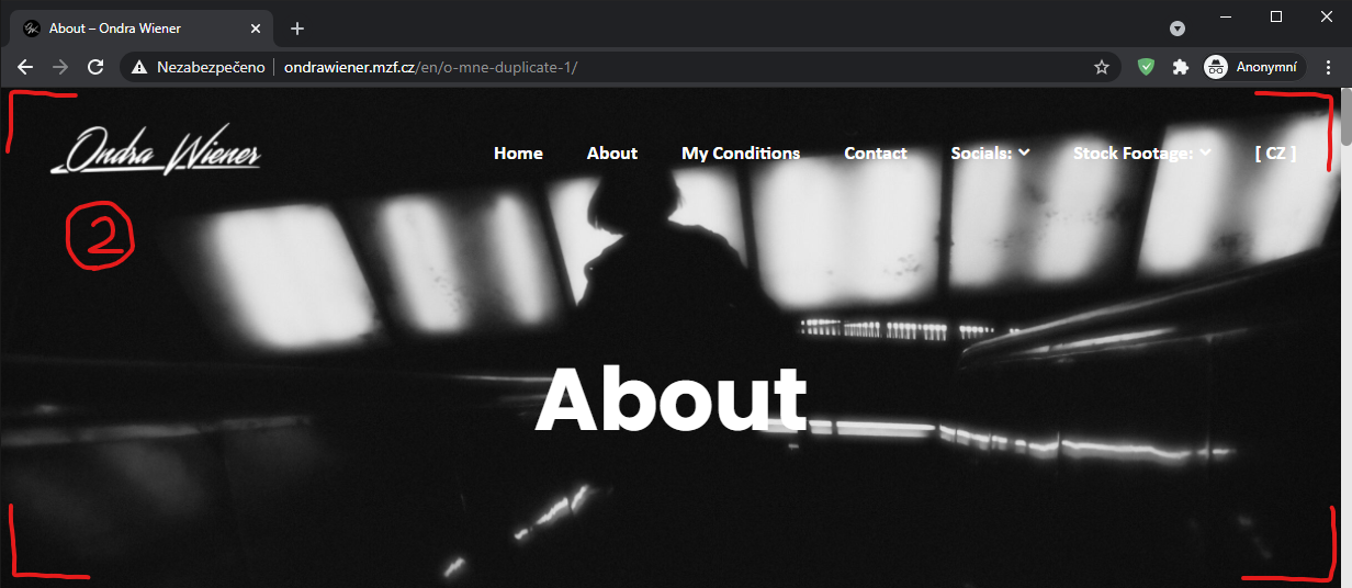
The first one (as seen in the pictures below) is the jumbotron images on all the pages not keeping their height in context of the page while opened in a smaller google window (one that’s not full screen).
If it is possible with the template, I’d like the images not to zoom in and out as the window gets thinner and wider, keeping full height at all times and staying adherent to the top of the window, not sliding upwards out of it when window gets pushed short.
(I found out the pushing-out issue only occurs with ‘scroll with page’ on, so if it can’t be easily tweaked, I’d settle with disabling it altogether- though I don’t seem to find where to turn it off on other pages than the home page).
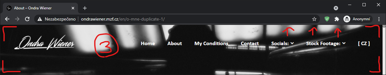
Also, when I’m on it, the images appear to not be at full width when full screen, even though they could be and it seems that up to about a quarter of their height gets unnecessarily hidden under the pages static content, I’d like to fix that too.
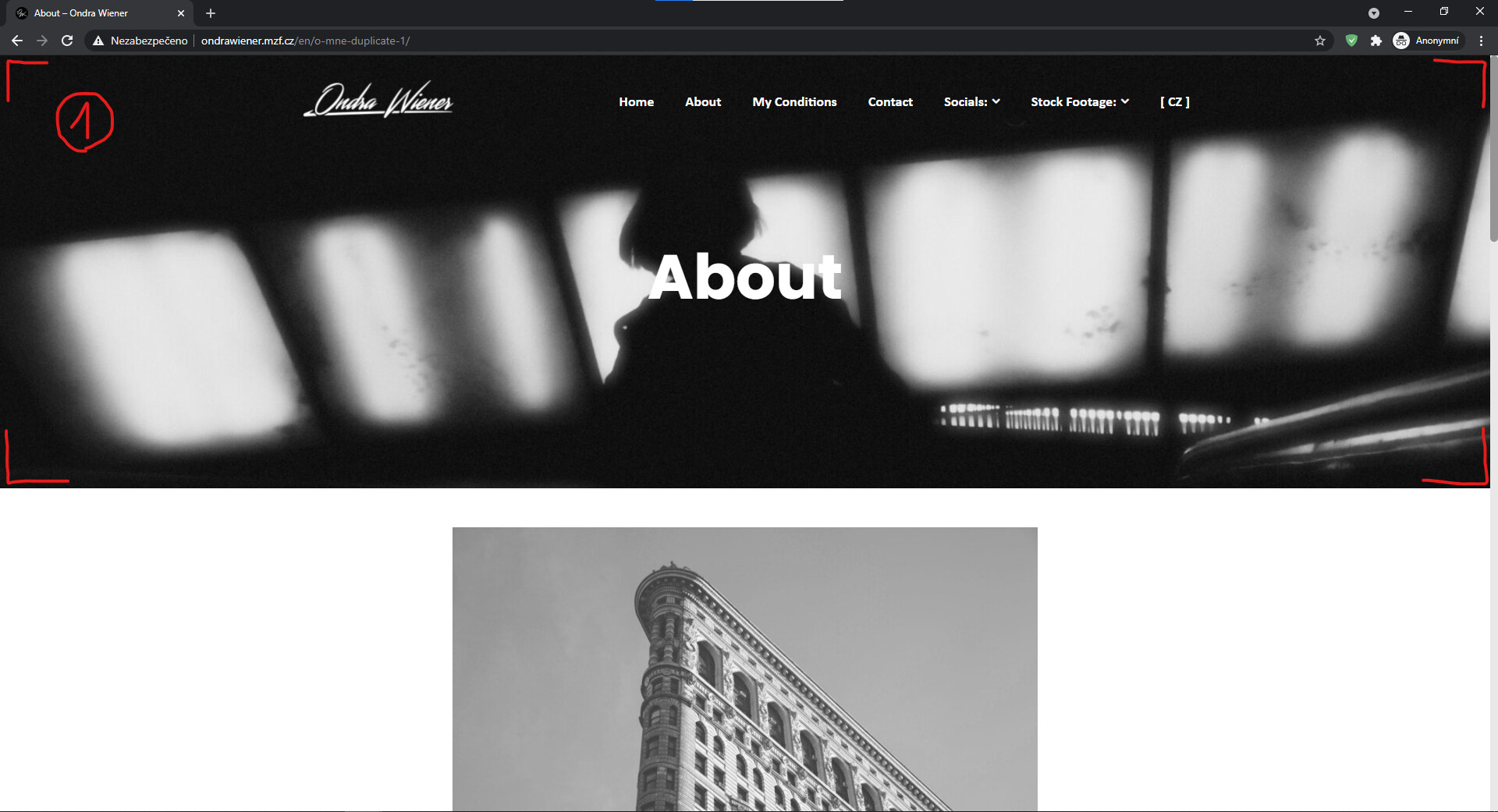
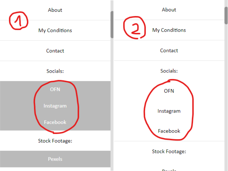
Fot the second one, It’s just that the sub-options in the pop up menu on mobile lose their grey look (set in the color scheme) and turn white when on any other page than the homepage (as seen in the picture below.
I’d like the color to stay consistent throughout all pages.