To Whom This May Concern,
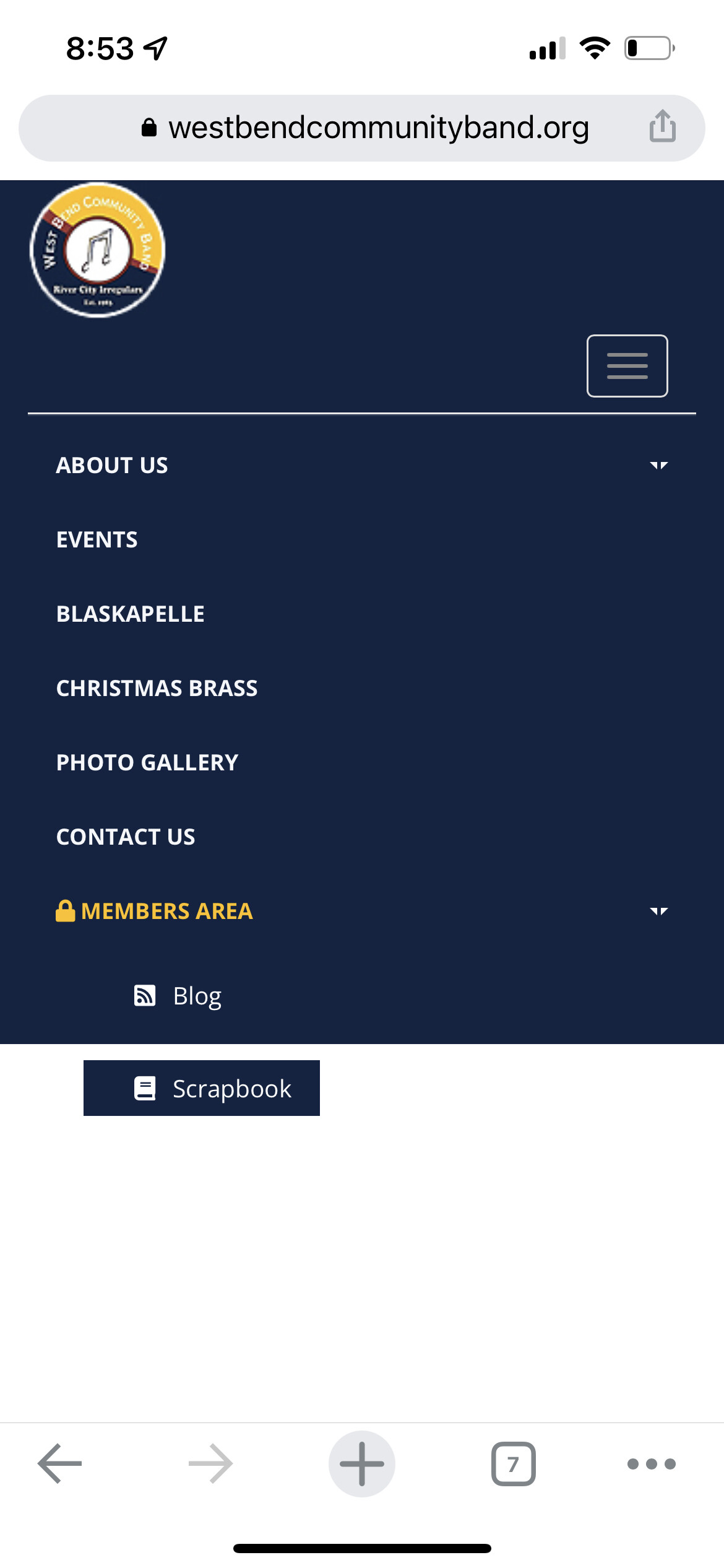
My site (westbendcommunityband.org) is running Wordpress 5.9.3 with Sparkling theme 2.4.9. The top navigation bar includes a menu with the following:
ABOUT US
EVENTS
BLASKAPELLE
CHRISTMAS BRASS
PHOTO GALLERY
CONTACT US
MEMBERS AREA
When I browse my site on my iPhone 13 Pro via Google Chrome and click the hamburger icon, the menu only shows the first 5 menu items.
How do I fix this, so the menu displays all menu items?
Thank you.
Hi there
Please try this css code in the Appearance > Customize > Additionall CSS:
@media (max-width: 767px){
.navbar-nav > li {
    padding: 0px 15px;
    color: #F5F7FA;
}
}
Hi, @colorlibsupport,
Thank you for your quick reply.
I added the CSS code and it helped; however, the last menu item still does not display correctly:
Please advise.
Regards,
Scott
Hi @colorlibsupport,
Just checking if you had a chance to review my update from May 26.
Thank you,
Scott
Hi Scott
This css code can fix it:
.navbar-default .navbar-collapse, .navbar-default .navbar-form {
    max-height: initial !important;
}
Hi, @colorlibsupport,
The last CSS code you provided resolved the issue.
Thank you!
Thanks and have a good day