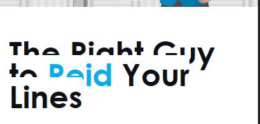
The problem is that on mobile, it looks like this:
And anywhere the text is long with a H3 header, it does the same effect. Even “What You Should Expect” appears very close together on mobile.
Any suggestions on fix?
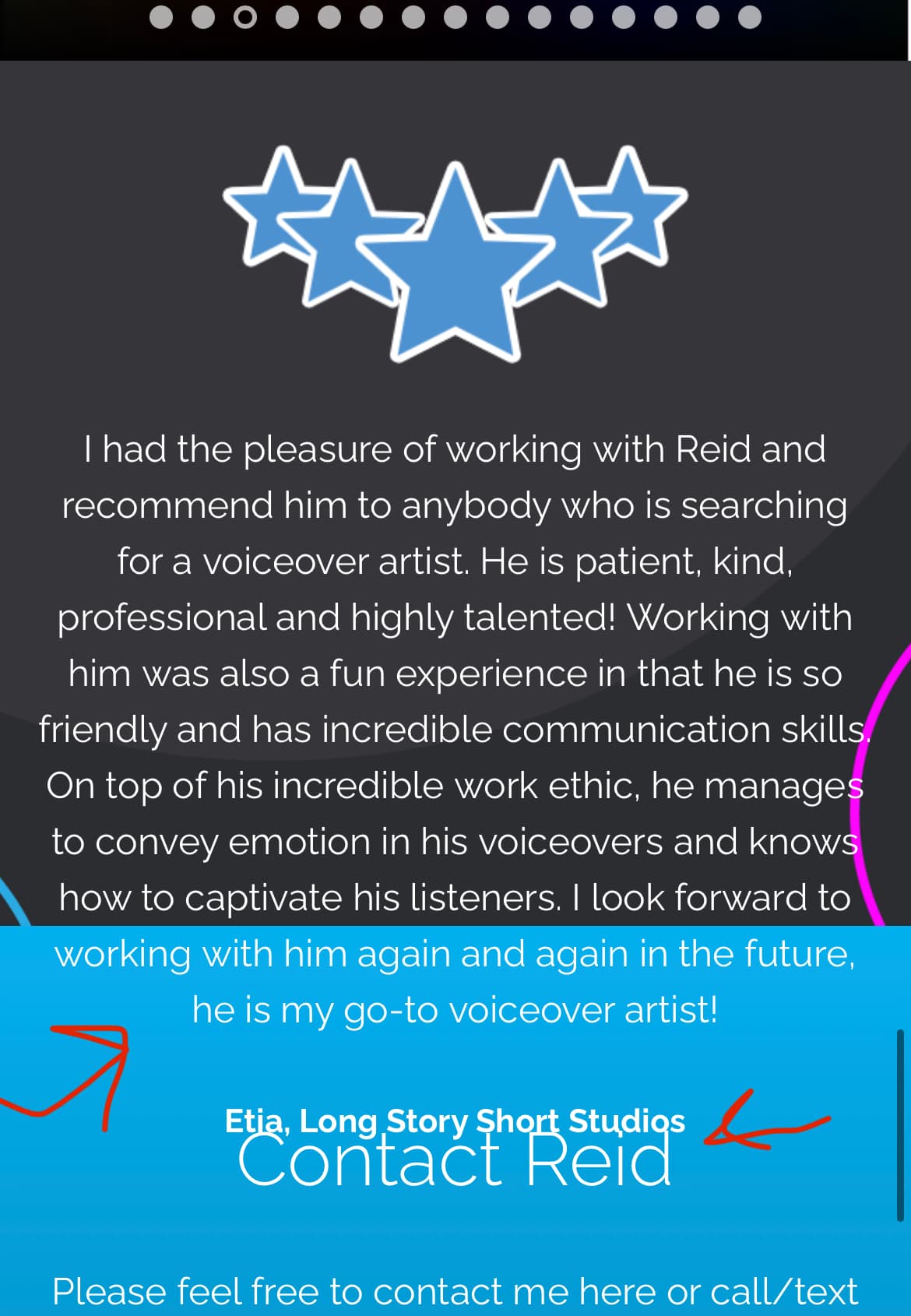
Issue 2: Testimonials are bleeding into other content on mobile
Some of the testimonials on mobile are bleeding into the Contact Section of the website. I’m not sure why, it’s just a couple as shown below:
It’s worse than pictured, because I’m using the Chrome Inspector Mobile view, but on a mobile phone, there’s a bit more text bleed.
Sorry, im really out of idea why is like that, I tried all CSS codes but its still not changing, it appears to be controlled by JS, I think it will require more than simple CSS :((
@colorlibsupport it hasn’t been an issue prior on this theme, I’m not sure what’s causing the review text to overlap. Surely there has to be a way to fix it. Can you think of any other solutions? Happy to give you access to the admin panel if you want to play with it. I’d really appreciate if you could help me fix this.
Ok, let me find something, it will require some testing so, if you are comfortable with sharing admin details privately send them to me in a private message
