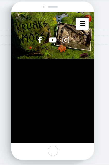
Hi, I’m building an album promo page for a local band and I have a header image that has to be visible at the top of the page. The problem is though that it currently looks bad on smaller devices since the important visual information isn’t visible on the image.
Hope you are having a good day and thank you for your question
Please provide link to the page
Have you tried different settings for your image? when you assign an image for header there are different settings for the image, please check them
Hey, thank you for the fast response!
Sadly, I cannot provide a link at this time. I’m hosting it out of my own web server and I currently have a public shared IP address and have no way of forwarding ports here. Just wanted to get everything working before I migrate the site.
As for the different settings, yes I did try them. Sadly there is no “fit to screen” or equivalent there.
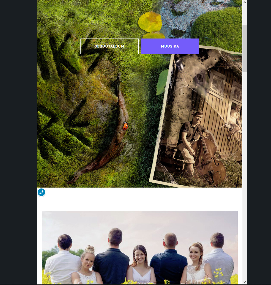
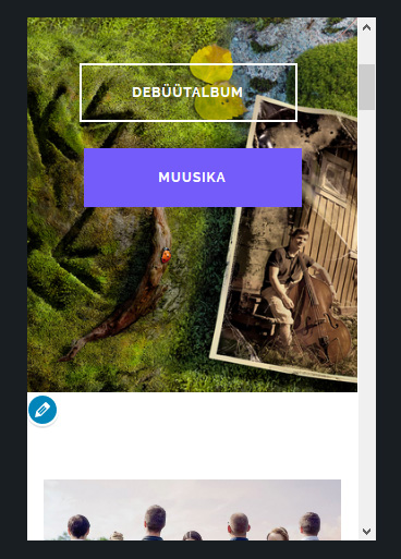
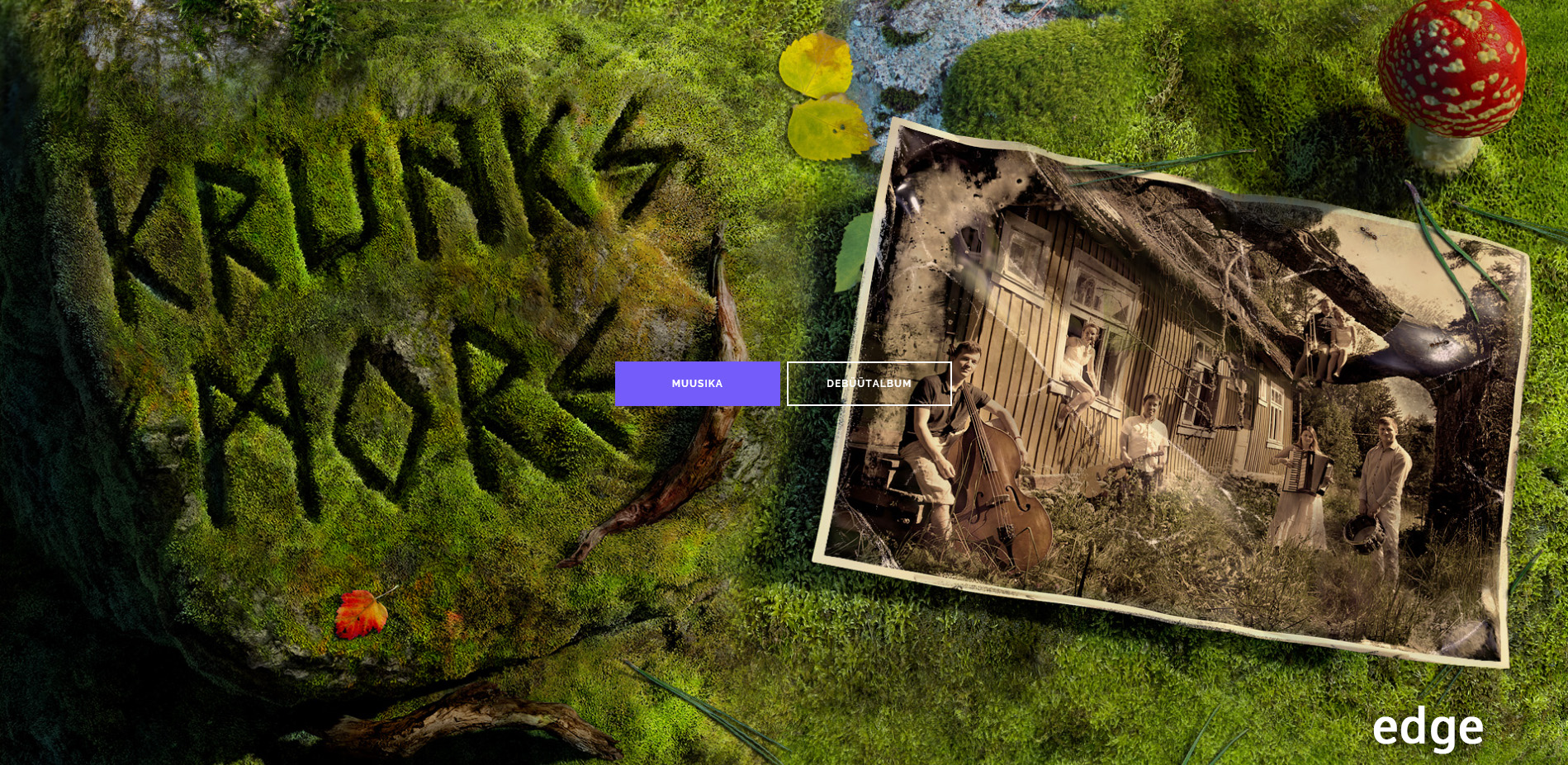
Just to be clear, I’m talking about the default “Homepage” section under Widgets as illustrated here: https://i.imgur.com/MHW305v.jpg
Should be possible with some CSS I guess?
Im not sure if my answers will be good without your website,
Basically this is all about image setting, you can use private message option to hide content of your message
I still have the same problem described above though: the main image has to be fully visible in all devices (fit to screen).
user:hoplaa
pass:335AC4c#OWWq0Z%Kov
One more thing: different browsers seem to display images very differently: Firefox, Edge, Chrome
I don’t think it’s due to your theme, just the inner workings of said browsers. Still, the change is pretty drastic, is there something I can do?
OK, i see the problem, unfortunately while this is parallax image we can’t do anything with it, its possible to make changes to raw background image with css but when this is a parallax then its controlled by the JS and we can’t do anything, sorry
Its possible to hide but not to show different picture or section,
My suggestion is to use page builder like Elementor, Beaver builder or anything else, they have great controls on such things

 its impossible to cover everything in the free theme
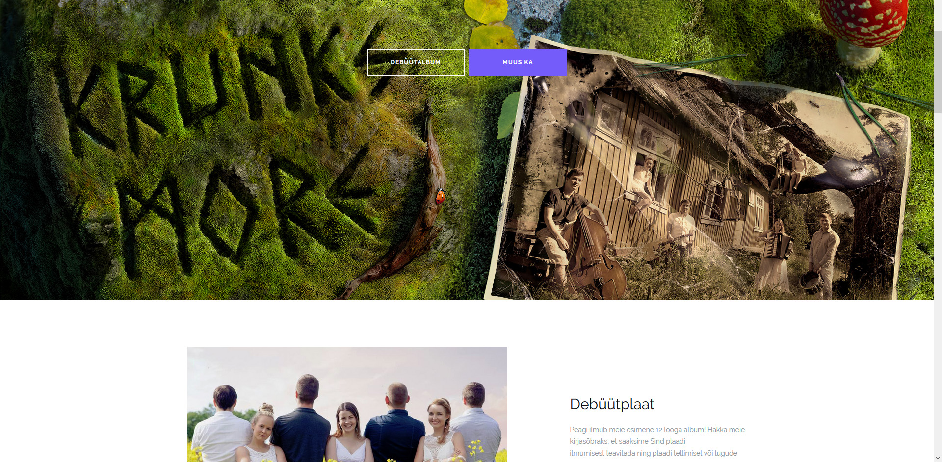