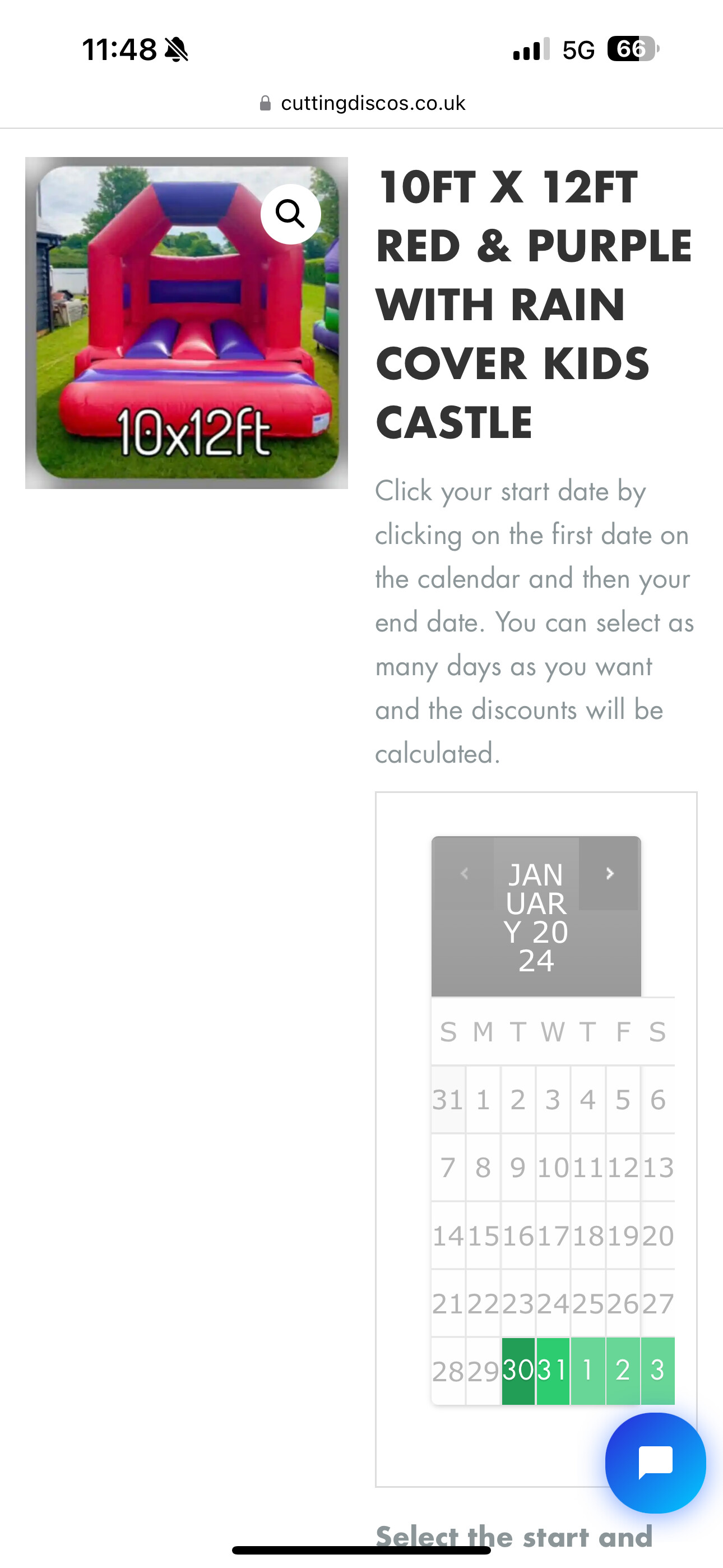
Hi My woo commerce booking system isn’t showing the calendar very well. It shows as squashed up when viewed on a mobile device. I reached out to woo commerce who said this
The reason for that is that your theme, Illdy, is not fully compatible with mobile screens – because of that, the “main” column of product pages (where it shows the product description, as well as the calendar) always gets just less than 50% of the screen width (with a maximum of about 340 pixels wide). You can imagine that on smaller screens, that’s not a lot of space.
Is there anything that i can do to make this work without changing the theme ?
Many thanks in advance.
Dear @Djacey123,
I hope this email finds you well.
I understand that you are experiencing an issue and I would be more than happy to assist you. Could you please provide a screenshot of the issue along with the steps to replicate it? If it’s a CSS issue, I will do my best to help you resolve it.
Looking forward to your response.
Warm regards,
Hi thanks for the reply. My woo commerce booking calendar is showing all squashed up. Woo commerce are saying it’s an issue with the set up of the theme. Any help would be great. I’ve attached a picture of how is displays on a mobile device.
Thanks
Andrew
Hey Andrew,
Can you please provide the direct link to this page? I have tried several pages but can’t see the calendar: https://cuttingdiscos.co.uk/
Regards,
Hi Andrew.
Please add this CSS code in the Appearance > Customize > Additional CSS:
@media only screen and (max-width: 600px) {
.woocommerce #content div.product div.images, .woocommerce div.product div.images, .woocommerce-page #content div.product div.images, .woocommerce-page div.product div.images, .woocommerce #content div.product div.summary, .woocommerce div.product div.summary, .woocommerce-page #content div.product div.summary, .woocommerce-page div.product div.summary
    width: 100%;
}
}
Let me know if you need further assistance,
Regads,
Hi thank you for sending this over. Having inverted the code it hasn’t made any difference to viewing it on a mobile device.
Hey there,
Can you show me the code in the CSS box? it should work. please share the screenshot
Regards,